
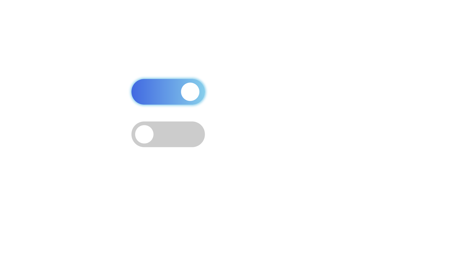 |
| CSS Animated Toggle Design |
Tutorial on CSS Animated Toggles
Code : (If want Without CSS Animation Toggle/Switch Design Code, Click Here)
<!DOCTYPE html>
<html>
<head>
 <title>Creating Toggle</title>

<style type="text/css">

 *{
  margin: 0px;
  padding: 0px;
 }

 body{
  margin: 30%;
 }

 label{
  position: relative;
  width: 80px;
  height: 28px;
  display: inline-block;
  border-radius: 34px;
 }

 span{
  background-color: #ccc;
 position: absolute;
 top: 0px;
 bottom: 0px;
 left: 0px;
 right: 0px;
  cursor: pointer;
  border-radius: 34px;


 }

 span::before{
        background-color: white;
        position: absolute;
        width: 20px;
  height: 20px;
    left: 4px;
  bottom: 4px;
  border-radius: 50%;
  content: "";
    transition: .4s;

 }

 input{
  visibility: hidden;
 }

 input:checked + span{
  background:linear-gradient( to right, royalblue, skyblue);
  animation-name: animate;
  animation-duration: .4s;
  animation-iteration-count: 1;
  box-shadow: 0px 0px 4px 1px skyblue;
 }

 input:checked + span:before{
  transform: translateX(50px);
  width: 20px;
  background-color: white;
  height: 20px;
  content: "";
  transition: .7s;

 }

 @keyframes  animate{

               25%{
                transform: rotateZ(10deg);
               }
               50%{
                transform: rotateZ(-10deg);
               }
               75%{
                transform: rotateZ(10deg);
               }
               100%{
                transform: rotateZ(-10deg);
               }
 }

</style>

</head>
<body>

<label>
 <input type="checkbox" >
 <span></span>
</label>

<br/>
<br/>


<label>
 <input type="checkbox" >
 <span></span>
</label>

</body>
</html>